From the very first wall, this exhibition declares that it will set ‘Beardsley in his social and artistic context’. The emphasis throughout is on Beardsley’s place as an artist and as a ‘quintessential figure of 1890s decadence’. But Beardsley was also a product of the rising print industry and his art stemmed from the increased use of photomechanical printing. Almost all of his drawings were illustrations, either intended as decorations for books or inspired by literature. The relationship between Beardsley’s illustrations and their source texts is both complex and fascinating. Consequently, I cannot help but feel that this exhibition should have endeavoured to situate him in his literary context, too.
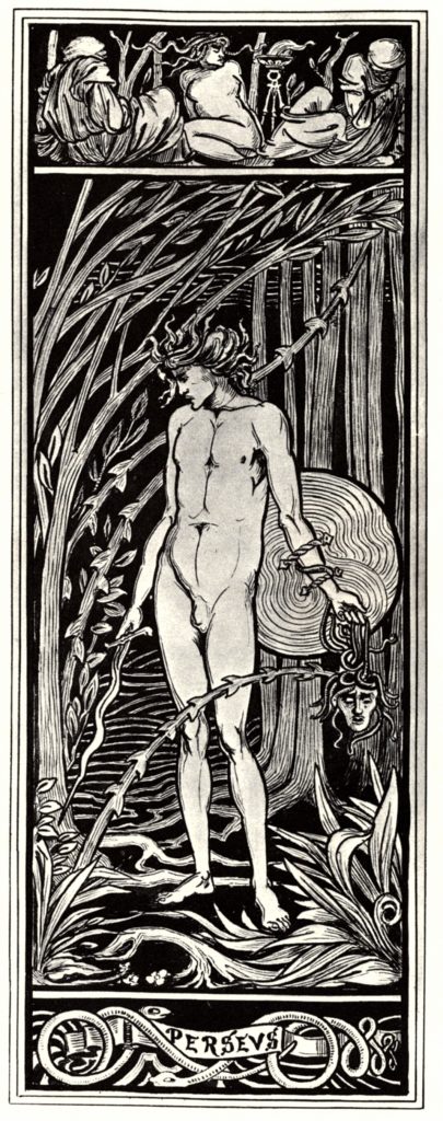
The first room provides a brief overview of Beardsley’s early works, with his 1892 self-portrait functioning as an introduction to the artist. The room also holds Burne-Jones’s designs for his ‘Perseus’ series, presented as a source of inspiration for Beardsley’s own Perseus. The labels suggest other influences and references, such as the paintings of Andrea Mantegna and Richard Wagner’s operas. Here, the exhibition sets Beardsley within an artistic context, pinpointing specific influences in his work. But Beardsley’s passion for literature is not noted, despite the appearance of his illustration for Hamlet (Hamlet Patris Manem Sequitur). The tone established in this first room pervades the entirety of the exhibition; Beardsley is portrayed as an artist of the grotesque, and the literary nature of his work often takes a back seat.
The next room, my personal favourite, is dedicated to Beardsley’s first commission, the illustrations for J. M. Dent’s Le Morte Darthur. Text and illustration are inextricably linked in these drawings, as they sit side by side on the printed page, and yet they are equally disparate, as the subjects of the illustrations stray from Malory’s medieval narrative. This is alluded to on the opening wall, which tells us that Beardsley went ‘off-brief’ during this project, by including ‘subversive details’ and ‘incongruous characters’ in his illustrations. However, this is possibly one of the only references to Beardsley’s playful relationship with Malory’s text. We are left to determine what these ‘subversive details’ are ourselves, without even a caption explaining the narrative moment. The labels in this room are wanting, illustrations are not contextualised and, as such, a viewer unfamiliar with the text is unable to engage with these works as illustrations. Furthermore, The Order of Chivalry, printed by William Morris and the Kelmscott Press, appears in this room, placed alongside the copies of Beardsley’s Morte. It is included as a comparison piece, and the label tells us that Kelmscott editions, like this one, were a ‘reference for Beardsley in terms of decoration and design’. This label, although true, implies that Beardsley’s work is a mere emulation of the Kelmscott Press illustrations when, in actuality, he goes almost as far as to parody them. William Morris was outraged with Beardsley’s illustrations, and complained to Burne-Jones that ‘a man ought to do his own work’, and Beardsley was equally insolent when he wrote to a friend that whilst Morris’s designs were ‘mere imitations of the old stuff’, his own work was ‘fresh and original’.[1] This tension between the two artists is almost reflective of the tension between medieval text and black and white image in Beardsley’s Morte illustrations. Elsewhere in the exhibition, biographical anecdotes are used to contextualise Beardsley’s style and subject matter, and that the Morris-Beardsley friction is not recounted here seems to me a missed opportunity to demonstrate Beardsley’s queer, parodic approach to illustration. Beardsley’s illustrations for the Morte appear, in this exhibition, to fall victim to the same treatment that they have received in academic criticism; the Morte drawings receive less attention as critics and viewers alike wish to move quickly on to the later, more exciting and notorious works.
Moving through the room ‘Something Suggestive of Japan’, we reach the space titled ‘A New Illustrator’ which, using The Studio’s article as a springboard, situates Beardsley’s work in its material context more clearly. Copies of the Bon-Mots and the Keynotes series are encased in glass, situated directly beneath the original drawings (a display also used for the Savoy illustrations). This method of display places illustration and material text together, allowing us to compare original drawing and reproduction on the page.
Then, we reach ‘Salome’. This room felt like the one everyone had been waiting for; the ominous music from Alla Nazimova’s silent film Salomé, which can be heard from the start of the exhibition like a siren’s call, was at its loudest and the dark green walls and low lighting force the viewer to look closely at the illustrations. It felt, quite aptly, as though we had reached The Climax (please forgive the pun). The wall briefly recounts the story of Wilde’s Salome, equipping the viewer with knowledge of the narrative in preparation for Beardsley’s illustrations. Moving anti-clockwise, we begin, appropriately with Beardsley’s cover design for the play. Then, all semblance of narrative chronology is lost. The order of the illustrations run almost from the end of the play to the start, with a few exceptions. Whilst many of the labels do explain the moment depicted in the illustrations, the order means the narrative was incoherent. Although this does not detract from visually appreciating the drawings, it does seem counter-intuitive to the display of illustrations by an intensely literary artist, who carefully constructed his drawings in relation to their material texts.
Other rooms, however, such as those for The Rape of the Lock and Mademoiselle de Maupin, offer descriptive labels and place the illustrations in narrative order. The labels also provide quotes from the texts, allowing the viewer to compare text and image, and engage with this interesting relationship. Materiality is never forgotten throughout the exhibition, each room holds a copy of the printed text or periodical, and sometimes even a pirated copy or a second edition appears.
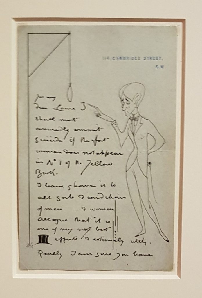
Nevertheless, the primary focus is on Beardsley as a visual artist. The exhibition locates him firmly within the 1890s decadence and places heavy emphasis on his dandy aesthetic. A whole room, titled ‘Beardsley’s Circle’, is dedicated to portraits of the artist and his friends. The iconic Blanche portrait is framed by black velvet curtains and is hung above Beardsley’s work-table, which is littered with copies of his illustrations and his paper knife, which very much plays into his self-construction as a dandy-aesthete (it was just missing the candlesticks). The appearance of Beardsley’s letters around the exhibition, particularly the one to John Lane in which Beardsley draws himself next to the gallows as he threatens to hang himself if an illustration is not printed, reveal his dramatic personality. Other favourites of mine featured here include the poem he wrote concerning the expurgation of ‘Enter Herodias’ – ‘Because one figure was undressed / this little drawing was suppressed / it was unkind – / but never mind – / perhaps it was all for the best’ – and the famous quote ‘I am nothing if I am not grotesque’. These details work to create a real idea of Beardsley’s character.
In accordance with the focus on Beardsley as an artist and, in fairness, the fact that this was an art exhibition, Beardsley’s own literary endeavours are underrepresented. He also saw himself as a writer, once declaring ever so humbly to an interviewer that his favourite authors were ‘Balzac, Voltaire and Beardsley’.[2] The illustrations for his own unfinished novel The Story of Venus and Tannhäuser are dotted about the exhibition, in the Savoy and the Epilogue rooms, which also features copies of the expurgated version, but it perhaps would have been interesting to see these brought together and accompanied by quotes from the text itself. The labels downplay the story as Beardsley’s ‘erotic novella’, which does not even begin to suggest the utterly bizarre events that occur in the narrative. The secretive ‘Curiosa’ room, with its explicit content warning and the infamous Lysistrata illustrations, would surely have been the perfect place to bring together the illustrations and some indications towards the obscene goings-on in Beardsley’s Venusberg.

The exhibition is a bold attempt to showcase the products of Beardsley’s short but explosive career. By dividing the rooms according to his main projects, it succeeds in tracking the evolution of Beardsley’s style, although the sheer volume of illustrations does mean that time perspective is sometimes lost; Beardsley simultaneously worked on the Morte, Salome, and the Yellow Book but the three appear as entirely separate parts of his life. The presentation of Beardsley as artist culminates in the final room, which showcases examples of Beardsley’s influence over other artists, both in the early 1900s and in the Art Nouveau revival of the 1960s. This feels an appropriate end to the exhibition, particularly as the final door leads you out opposite the gift shop, in full view of a new round of 2020s Beardsley memorabilia. Ultimately, the exhibition achieves its aim to set Beardsley in his ‘social and artistic context’, but in doing so, it misses out key elements of the artist’s life. In this review, I have endeavoured to briefly outline Beardsley’s literary contexts, but there are many others. Beardsley was idiosyncratic; he was an artist, illustrator, editor, writer, brother, son and Roman Catholic, and this exhibition seems to try too hard to cast him singularly in the role of the dandy-aesthete artist.
[1] Aymer Vallance, ‘The Invention of Aubrey Beardsley’, Magazine of Art, 22 May 1892, pp. 362-9 (p. 364); Aubrey Beardsley to G. F. Scotson-Clark, c. 15 February 1983, in The Letters of Aubrey Beardsley, ed. by Henry Maas et. al. (London: Cassell, 1970), p. 44.
[2] Arthur H. Lawrence, ‘Mr Aubrey Beardsley and His Work’ in The Idler, 11 (1897), pp. 188-202 (p. 200).