In this age of social distancing, visiting a gallery is a truly odd experience. The last time I was in a gallery was in February, at Tate Modern with a coach-load of GCSE and A level students doing research for their exam projects. And we know how that turned out. So I was delighted to be back – this time, at Tate Britain.
In the first three rooms of the Tate’s Beardsley exhibition, the drawings go around the walls, all at the same level and pretty much all the same size, and there is a massive empty space in the middle of the room. Masked viewers and visitors lurk in the middle of the room and try to dive into any empty space which comes up in front of a drawing, whilst keeping away from everyone else.
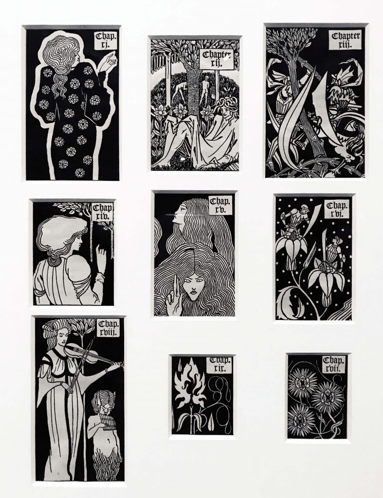
As the drawings are very small and much less than two metres apart, this is rather difficult. There is no sense of continuity or the sequence in which the images are intended to be seen, as, after a few minutes trying to time your movement around the walls, hanging back and moving forward in that weird natural flow as most people did in a gallery pre-social distancing, frankly, I just gave up and went and looked at any pictures without any viewers in front of them, then later went back to fill in a few gaps. There are, of course, too many gorgeous designs to describe. I particularly liked the chapter headings for Le Morte Darthur, which were like beautiful little postage stamps displayed in a cluster in a large frame.
I also spent a lot of time gazing at Siegfried and How King Arthur Saw the Questing Beast. Both have gorgeous incredibly fine lines, which look more etched than drawn. The catalogue pictures give no idea of how detailed and beautiful, or indeed how small these drawings are. I don’t think I have ever seen so many different sorts and weights of line in one image, and that’s before one starts looking at the dots. Beardsley does wonderful dots. And dragons.
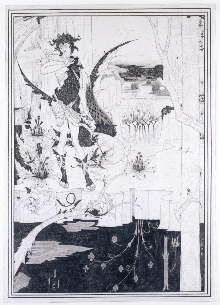
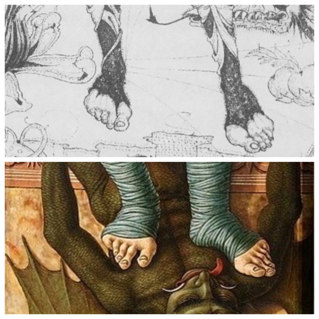
Whilst hogging the view of the Siegfried drawing, I noticed some details which convinced me that Beardsley had recently spent a lot of hours in the National Gallery in preparation for these drawings. In the image, there are two landscapes, one above the other, beautiful tiny works of art in their own right, which looked exactly like the backgrounds of renaissance paintings. I am still not sure which ones, but I am absolutely convinced that I will spot them next time I am in the National Gallery. And the feet… Siegfried’s feet are straight out of a Carlo Crivelli painting. Crivelli is one of my favourite artists and the best painter of feet ever. He is also brilliant at tiny gorgeous details, as of course is Beardsley.
The tree trunks at the lower of the two small landscapes in Siegfried (centre-right) seem to actually melt away as they go downwards, a curious effect as logically you would expect the landscape to soften and fade away into the distance as you look upwards, in proper atmospheric perspective fashion. But here it melts away below in a slightly odd shimmery way. This is the sort of detail which is not evident in catalogue pictures.
Sadly, my reading glasses kept steaming up. Wearing a mask and specs is a challenge and, clearly, I have not yet got the knack. And these are very small drawings. So I found myself not only darting into an empty space to look at a lovely Beardsley, but taking off and constantly cleaning my glasses, whilst also avoiding getting too close to other visitors. Like me, people were getting absorbed in looking closely and observing those tempting details and were forgetting about other people until brought up with a jolt and then moving swiftly apart. I should have brought a large magnifying glass.
As a result, I was exhausted with all of this bobbing and weaving around the first three rooms. All of that empty space in the middle of the gallery could have been used to spread out the visitors and add a sense of variety, or even drama in the presentation. This exhaustion was a shame as the Salomé room, the fourth, predictably was the one where it livened up.
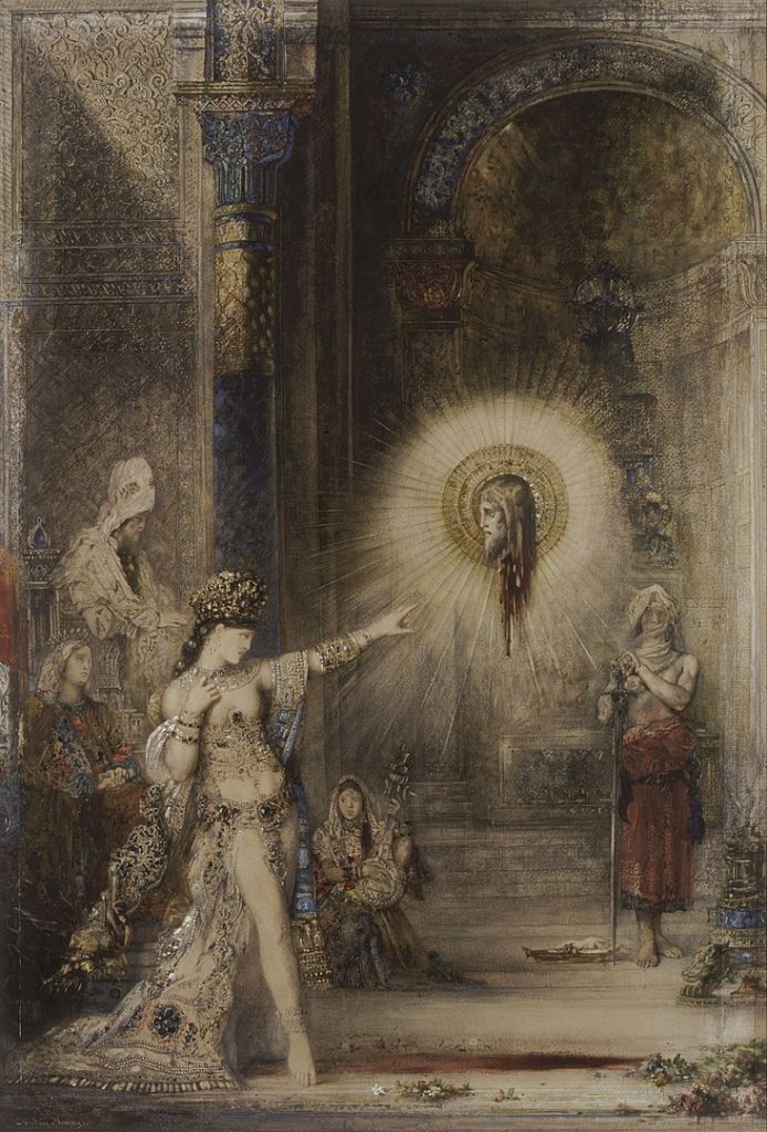
First of all, the colour was a gorgeous shade of turquoise, and there was Gustav Moreau’s Salomé, as glowing as a stained glass window, on the wall opposite Beardsley’s images. I immediately went to look at this to avoid the (socially distanced) twitchy crowds. Quite lovely.
The first effort in the exhibition at using the centre of the gallery space was a disaster. The cabinet with the lovely edition of Salomé with the gold peacock feather cover was in such low light it was almost impossible to see so I took a flash photo of it with my phone to look at afterwards. When I managed to duck in and creep in and out, it was interesting to see the different versions of the Salomé drawings, the deleted details and excised penises, even if I saw them in random order. The black areas of the drawings were among the most interesting things. We are familiar with the reproduced versions with their solid printed blots of black. In the originals, you can see where the brush was reloaded when Beardsley painted in these large areas.
Most of the gallery rooms were painted a different colour. In an exhibition where the works in the first three rooms are almost all in black and white, apart from a deliciously over the top Burne-Jones, this is worth noting. Sage green in the first Morte Darthur room. The ‘Suggestive of Japan’ section is a lovely aesthetic shade of primrose yellow. And so it goes on. Grey, lilac, rich purple. As if the black and white of the drawings are not enough to hold our attention.
As a Wildean, I confess my favourite room was the burnt-orange-painted ‘Beardsley and his Circle’. The variety and liveliness of those crazy 1890s characters cheered me up immensely. Mabel Beardsley, the theatrical tomboy, dressed as a page with a hawk; John Gray in a gorgeous shadowy little lithograph, the beautiful poet who inspired Oscar and became a Catholic priest; W.B. Yeats looking worried – didn’t he always? My favourite was the Max Beerbohm drawing of Smithers, the publisher and pornographer. The caricature was in a letter from Max Beerbohm to the poet John Betjeman. Brilliant to think of this dodgy 1890s character still being written about by a poet in 1947. And it’s always a delight to look into the face of Robbie Ross, particularly unexpectedly. It is like greeting an old friend. That twisted nose and worried expression. His face always reminds me of how kind Robbie was.
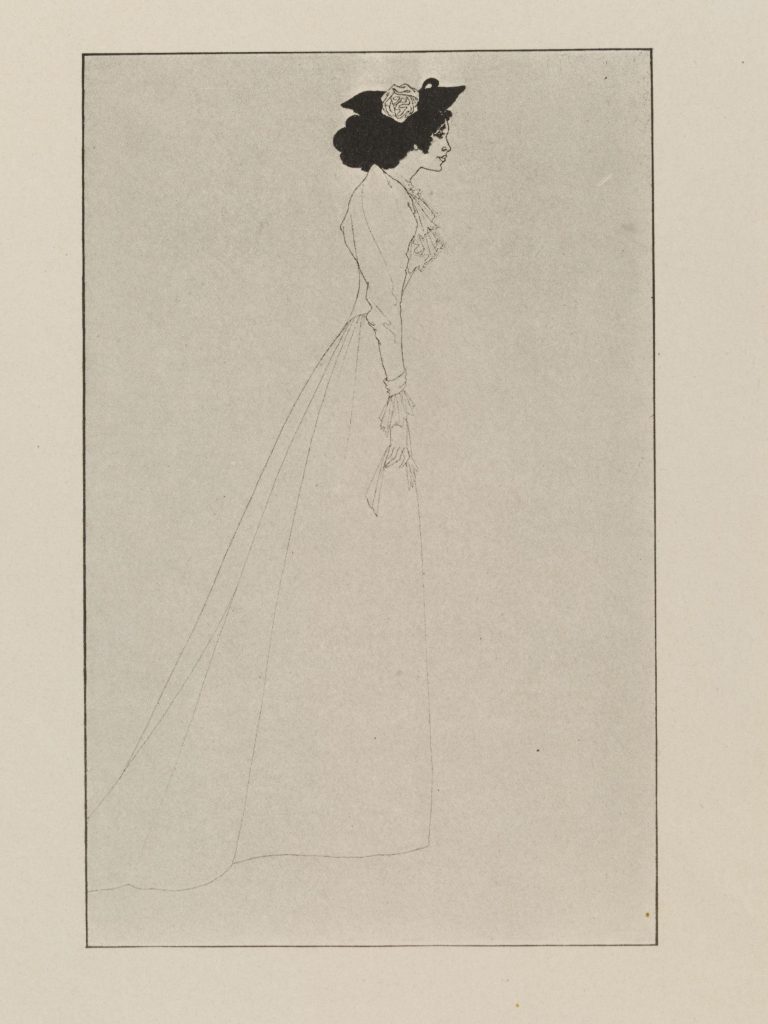
The rest of the exhibition really should have been kept for a second visit, as I was too overwhelmed with the visuals and too tired to do more than pick around the edges at things which caught my eye in the last couple of rooms. If you do go, pace yourself and don’t expect to see everything. Make sure you pay attention to the most exquisite things in the exhibition, though. For me, they were Siegfried’s feet, the incomparable Robbie Ross, glimpses of Oscar throughout and Beardsley’s exquisite portrait of Mrs Patrick Campbell. Mrs Pat, Stella to her friends, described Beardsley as ‘an unwholesome and incompetent fellow’, but he clearly thought she was beautiful.[1] If this is ‘unwholesome and incompetent’, I’ll take it any day.